
Before + After: Master Bathroom Remodel
Are you ready to see an amazing transformation we did for an awesome client’s bathroom and closet? Every photo can be clicked to see the before. Since this layout change was so major, I’ll start with the floorplans, but scroll past if you just want to see the pretty photos!
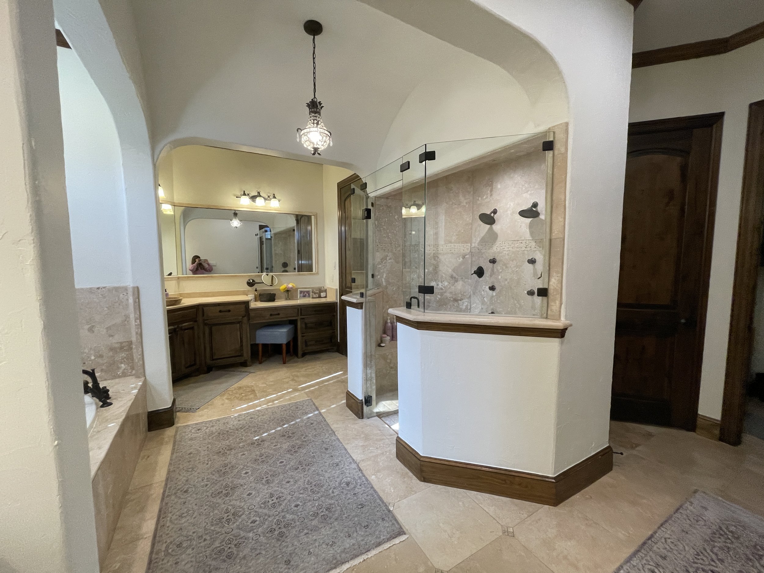
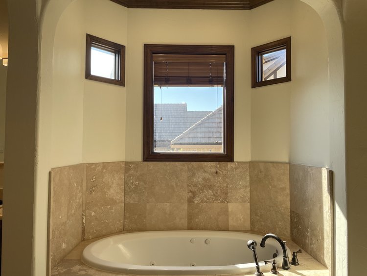
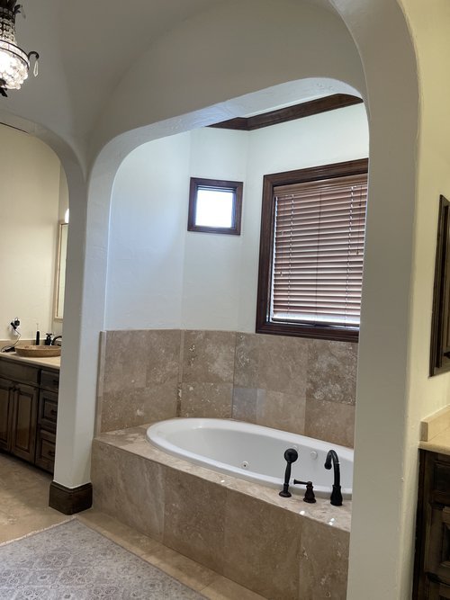
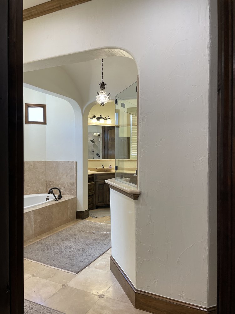
The immediate problem I noticed (click on the photo above for the before) were the unnecessary arches everywhere; they felt so contrived! You also had to walk around the shower that was placed right smack in the middle of the bathroom—so many awkward angles, weird half-walls—it all needed to go. Since closets were small and cramped—we would be stealing space from the bathroom to enlarge them, so removing these archways and taking the ceiling up was going to keep it feeling spacious.


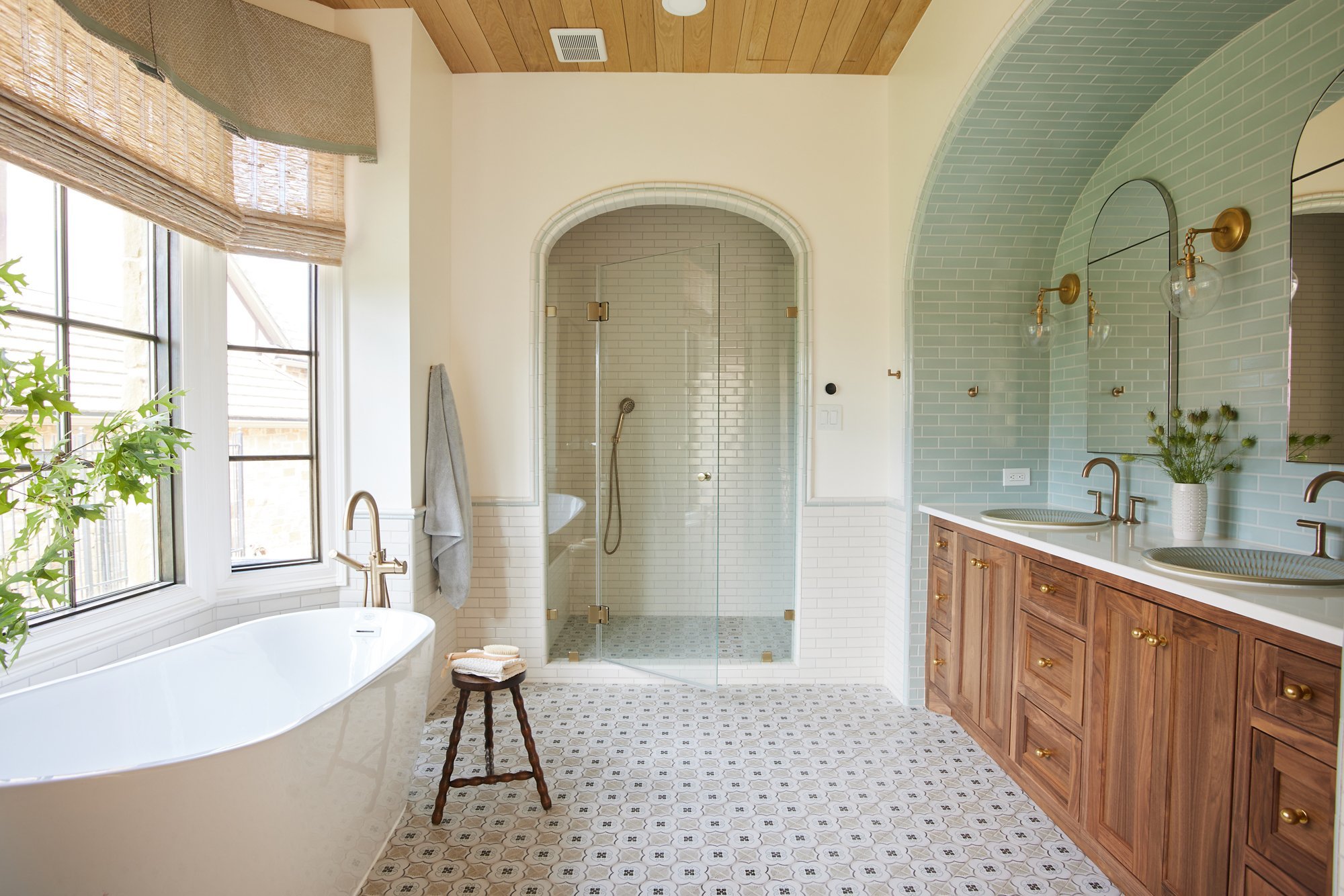
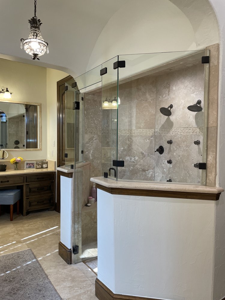
We shifted the shower over to the far wall, which visually felt better and allowed us to 1) combine the sinks into one vanity area, 2) include a built-in for linens (we used walnut and added beautiful furniture detailing which you’ll see below), and 3) free up space to the left of the tub for a makeup area for her.
We also combined the his/hers closets, but I’ll save that for the end of the post.
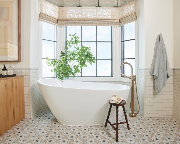
The tub, oh the TUB.
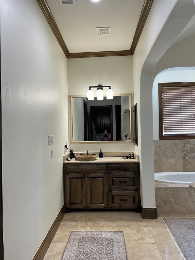
The windows were hodge-podge and sad—we replaced them with larger ones and trimmed them to appear as a cohesive unit. I love the two-tone walnut/white finish which ties in the walnut stain prevalent throughout the rest of the home (photos of that coming soon!) Removing the archways that were projecting into the room and swapping in a freestanding tub made the space feel light and airy.
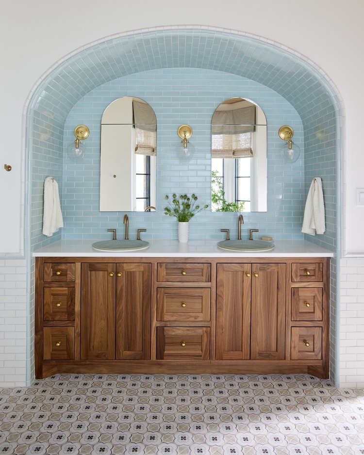
“Wait, I thought you were getting RID OF the arches?!” says the framer. Why yes, we are—the ugly ones—and replacing them with pretty elliptical arches! We clad the vanity arch in seafoam blue tile that continues around the room via pencil trim in the wainscoting.
Some practical details you can’t see—electrical outlets in the recessed medicine cabinet mirrors and in a grooming drawer so they can store allll the things out of sight. So clean.
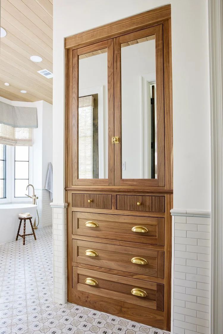
Now, this is an improved view upon entering the bathroom, no? Not your average linen closet—I love when you can check off both the form and function boxes. You can see in the mirror an exterior door we added leading out to a small patio we created in an underutilized part of the yard.
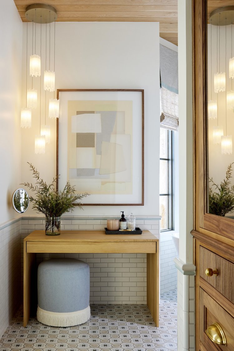
Initially in the plans this makeup vanity area was stone countertop/cabinet, but with so many hard surfaces in the bathroom already, I decided on a freestanding wood furniture piece to add warmth and keep it feeling open.
Fun fact, I proposed the wood ceiling idea in order to better conceal an attic access that we could not relocate (you can see it in the very first photo-bet you didn’t even notice!) and it added a lovely warm character to the space.
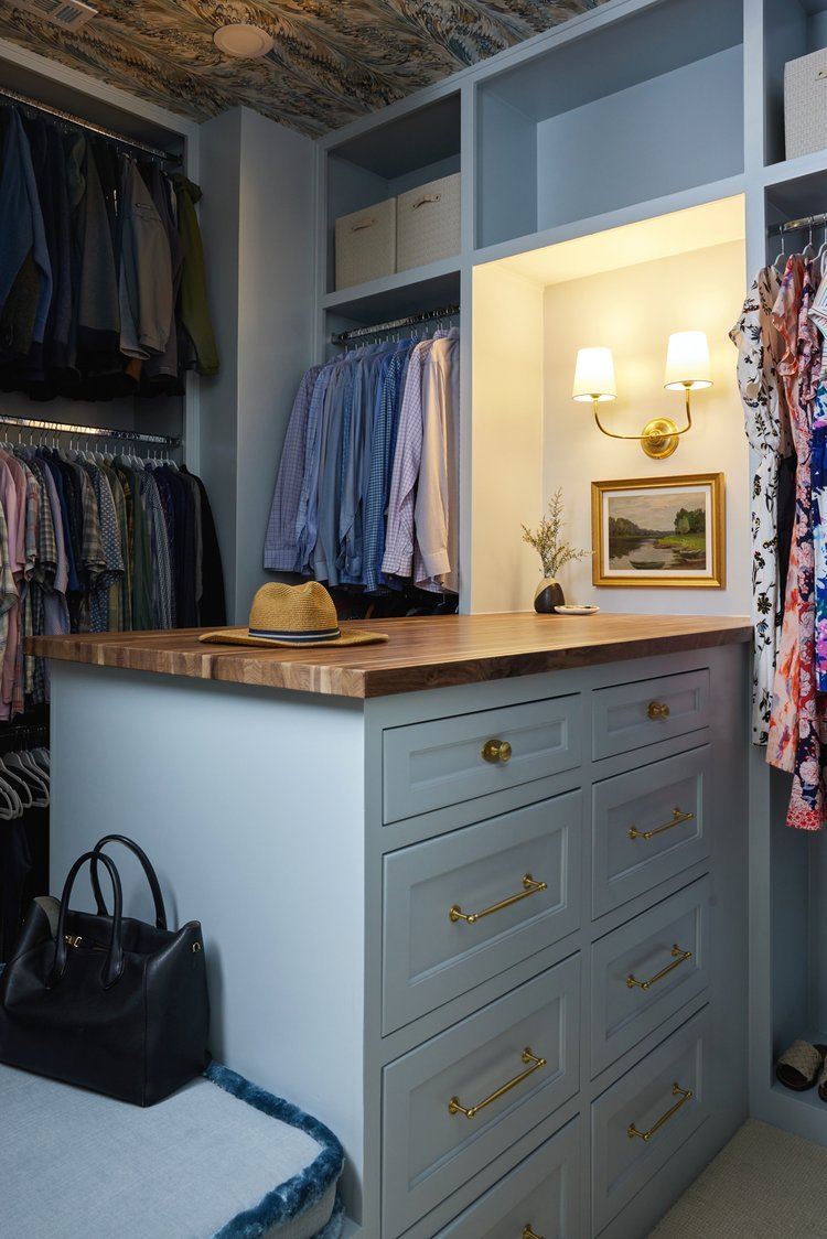
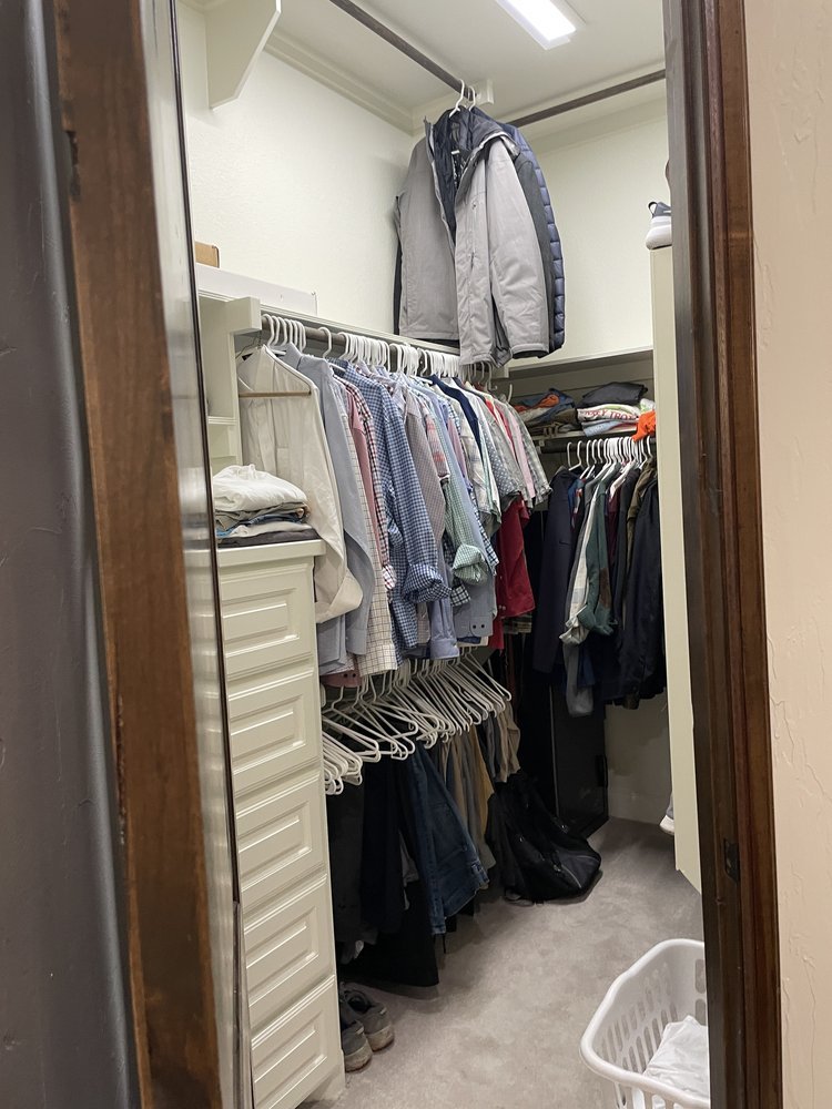
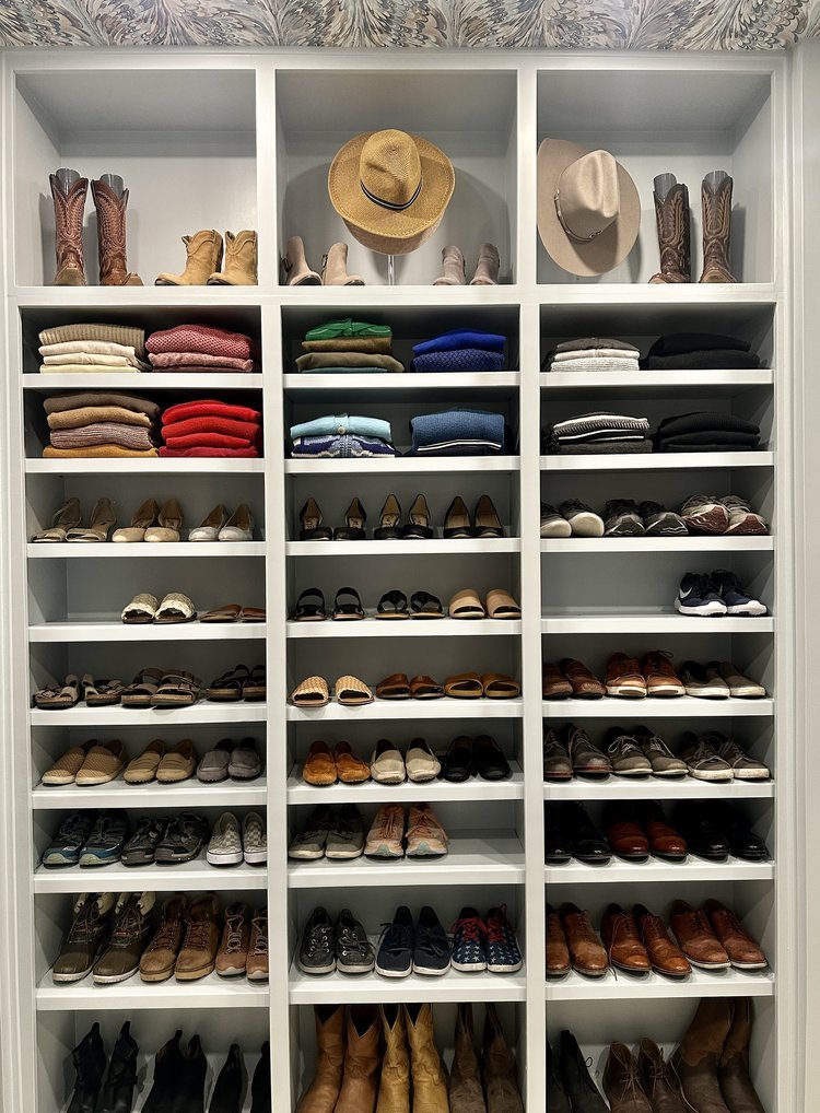
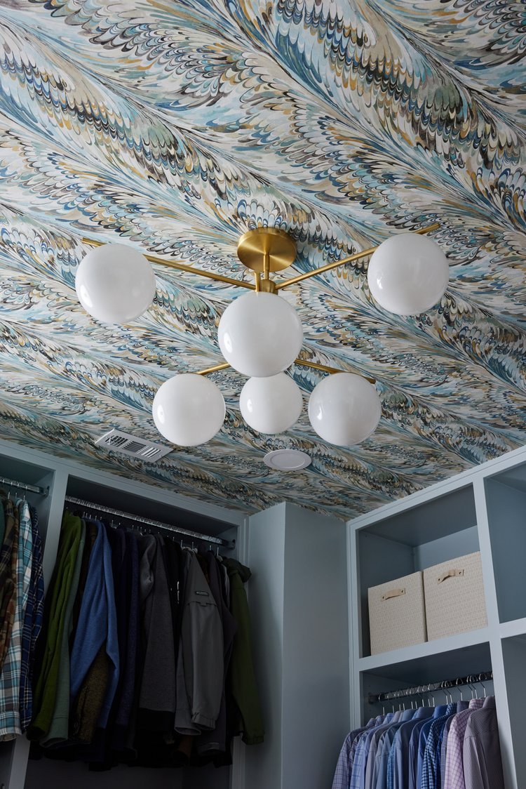
And lastly, the closet. We brought in The Organized Nest to help with the layout. A peninsula ended up making more sense than an island and they were able to incorporate very practical bench seating. If you look back at the floor plans you can see we combined his and hers into one closet. (The Mr. was very excited to now have access to the laundry chute AND have room for his gun safe!) Doing this eliminated a door in the bathroom, and made more sense given the square footage.
Renovations are my favorite! Do you have a part of your home you feel isn’t functioning right, or needs a major update? Whether you need turnkey interior design service, layout ideas or a plan review, we can help you!